The Exhibition Design: Accentuating, Taking a Stand
Since August 8, 2020, the former houses of the female guards at the Memorial Site Ravensbrück host the exhibition “In the SS-Auxiliary”. How did the designers of the exhibition approach this venue, which presents both a historical site and the exhibition's central object of display?
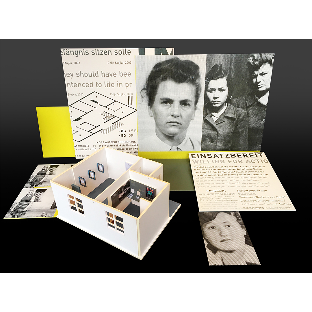
Those who might expect to find reconstructions of the historical interiors will search in vain. For the general design concept, bueroberlin (Ruth Schroers, Julia Neubauer, Vesselina Wilhelm and Christine Czaika) chose a minimal-invasive design, in which the view is never impeded by fake walls or other spatial interventions. Thus, the original architectural structure of the flats – divided into hallway, living and sleeping area – remains the main point of reference, and will be crossed by the viewer in this order each time when entering a thematic chapter of the exhibition.
The most prominent design decision is a “green ribbon” that runs along the walls throughout the exhibition space. As a matter of fact, a major part of the exhibition is to be found on this “ribbon”. It subtly imitates the generic architecture of the building, provides for orientation and guidance, allows for ruptures, and most important, intersects the different chapters and historical layers of the exhibition in unprecedented ways. The choice of the green's specific nuance is enhanced with a number of associations, but refrains from being explicitly 'identified'. The point is to accentuate; to call for taking a stand.
There is also a notable twist regarding the biographical presentations of the female guards. Their biographies are presented on freestanding steles spread across the exhibition. They are coated with the color of the “green ribbon”, but also “walk out” from the historical display on the walls, similar in this ambivalence, perhaps, to the relationship between a 'person' and a 'role'. This twist becomes even more tangible in the case of the biographical presentations of the female supervisors. Instead of the generic green, here a shrill yellow surfaces their steles, a color that would otherwise only be used for the typography of the exhibition. Counter-image, antithesis, radical difference, or just a little shift of colors? The exhibition design of bueroberlin will not answer these questions, but will help to look at the niches from where these questions raise.